Report Types
As the most important tool for analyzing the results of a load test run, XLT offers three types of load test reports, which are thoroughly illustrated in the sections below.
- Load test report: The bread and butter report for your daily work. It contains all information about a single test run.
- Comparison report: A quick way to compare two test runs and see the differences.
- Trend report: When you want to see the development of performance over time and set more than two reports in relation to each other, you will use the trend report.
Load Test Report
A load test report is a report for a single test run or a manually combined set of runs. This report gives you all the information needed for a detailed analysis of a test run. This is what you need most often.
Creating and Evaluating Reports
You can find more about creating and evaluating load test reports in the section Test Evaluation. More information about reporting options can be found in the Report Options section of the manual.
Comparison Report
(also known as: Difference Report)
The Comparison Report gives you a quick overview on performance improvements (green color tones) and performance declines (red color tones) between two test runs. The initial test run is labeled baseline. The test run being compared to the baseline is labeled measurement run.
The XLT comparison report feature helps you identify differences between test runs and derive the right actions from it. It visualizes differences on all measurement levels (transactions, actions, requests, and custom timers). A color code helps you to find the biggest difference quickly. Therefore you can easily combine it with the setup of your test and derive the next actions from it.
For instance you increased the memory limits of your server’s Java virtual machine and you ran the same test again. By comparing the results before and after the server configuration change, you can easily determine how much improvement you got. Of course, the results might have an error margin of 5-10% – in this case, you should question your test and ask yourself if you measure the right things over the right time period.
Interpreting a comparison report is simple, because its colors indicate the performance development and make it easy to see any development. Green cells indicate an improvement, red cells a performance degradation. The intensity of the color corresponds to the percentage value of the difference: the darker the color, the bigger the difference. Color values in the range of –10% to +10% are close to neutral white, because changes in that range are often measurement errors or normal fluctuations.
All data is relative and differences are reported in percentages. Hover the cursor over cells to see the measurement values of both reports. These details allow you evaluate the performance difference further by seeing the real values and hence the real difference. This means, a 100% difference can be OK, when the measurement values are small enough in the first place, such as 10 msec for instance. The second measurement reported 20 msec and therefore the performance dropped significantly in percent but not in milliseconds. A difference of 10 msec can be caused by a small network latency and might be normal white noise during testing.
Every section of the comparison report displays a table with performance changes and is divided into three parts:
- Count: The percentage values show the development of the performance in comparison to the baseline. Positive numbers in the count section indicate an improvement of the throughput over the baseline. Negative values indicate a decrease in throughput.
- Errors: Positive numbers indicate an increase in the number of errors, negative numbers a decrease. An infinite sign indicates the occurrence of errors in comparison to an error-free baseline.
- Runtime: Positive values indicate a poorer performance, negative values an improvement (smaller runtime values) over the baseline.
When you hover the mouse over the columns of the report table, you can see the actual measurement results, which let you determine whether or not the reported percentage change is significant.
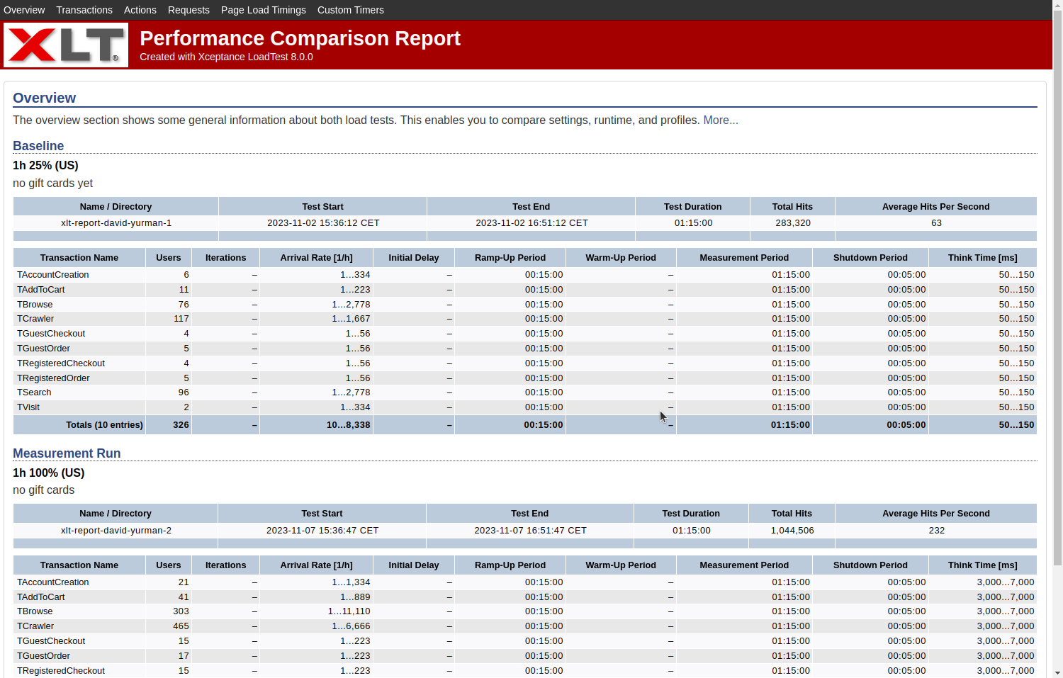
Performance Comparison Report - Overview

Performance Comparison Report - Actions
Sections
Overview
The overview section shows general information about both load tests. It lets you compare settings, runtime, and profiles. In the later sections, the percentage values depict the development of the performance in comparison to the baseline. Note that the total columns (total throughput and total errors) might present misleading values if the load tests used different runtime configurations. All other values are normalized with respect to the runtime and therefore easily comparable. Positive numbers in the count section stand for an improvement of the throughput over the baseline, negative values for a decrease in throughput. An increase in the number of errors is indicated with positive numbers, a decrease with negative numbers. An infinite sign indicates the occurrence of errors in comparison to an error-free baseline. For all runtime numbers, positive values signify a poorer performance, negative values an improvement, or smaller runtime values, over the baseline. Added or removed transactions, actions, or requests are displayed, but for them no comparison is provided.
Transactions
- Count
- Errors
- Events
- Runtime
Actions, Requests, Custom Timers
- Count
- Errors
- Runtime
Create a Performance Comparison Report
A performance comparison report can only be generated between two existing load and performance test reports. That is, you first have to create both of these reports.
Then you can generate a performance comparison report using the following command (in <XLT>/bin):
./create_diff_report.sh <reportDir1> <reportDir2> [options]
For example:
./create_diff_report.sh ../reports/20190503-152920 ../reports/20190503-160520
Trend Report
Comparison reports are good to see the performance difference between two test runs in the greatest detail possible. However, quite often a series of test runs has to be compared to see how the application under test has changed over time in terms of performance. This is especially important for applications which are under active development. For this, XLT provides trend reports.
A trend report offers a comparison of multiple test runs. It depicts the development of the performance over time. Multiple measurements are taken into account and evaluated against each other. It shows how your system performs over time, how your tuning effort pays out, and how your live environment acts under a changing load situation if used as monitoring.
Two trend report types are available:
- Difference to First Run and
- Difference to Previous Run.
The Difference to First Run reports the changes compared to your first test run, mostly referred to as baseline. Each table column displays the difference between your baseline run and the run you’re interested in. The quality of your baseline run defines how valuable this report may be. You can also look at it as a long-term performance trend report.
The Difference to Previous Run visualizes the improvements between two adjacent test runs, which lets you recognize how your last change or tuning effort payed out in comparison to the previous run. It helps you to see whether or not you are on the right track regarding the improvement of your application’s performance. It also emphasizes sudden improvements or set-backs and can be seen as a short-term performance trend report.
When you hover the mouse over the columns of the trend report table, you can see the actual measurement results. This will give you a better idea whether or not the reported percentage change is significant. Please keep in mind that changes up to 10% are measurement fluctuation most of the time.
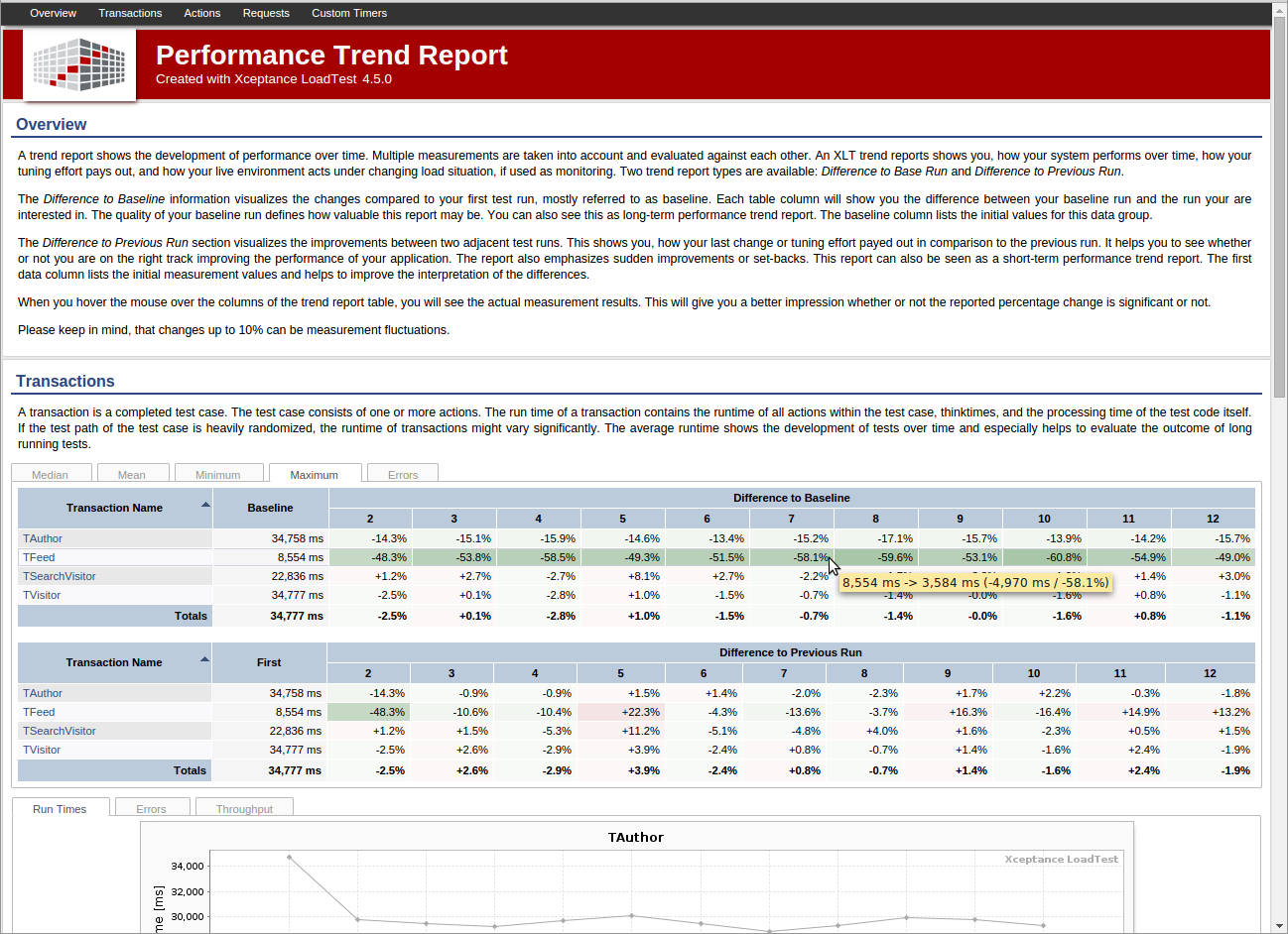
Performance Trend Report - Overview

Performance Trend Report
Similar to the other reports, the trend report is divided into the following sections, each containing the tables and charts mentioned above:
- Overview
- Transactions
- Actions
- Requests
- Custom Timers
Create a Performance Trend Report
To generate a performance trend report on several test reports, use the command below (from <XLT>/bin):
./create_trend_report.sh <reportDir1> ... <reportDirN> [options]
For example:
./create_trend_report.sh ../reports/20190503-152920 \
        ../reports/20190503-160520 \
        ../reports/20190503-161030 \
        ../reports/20190503-171030
The input reports can be specified either explicitly by listing them all one by one or by using wildcard characters such as “*”. In order to guarantee a deterministic order in which the individual reports are processed, the trend report generator sorts the input reports based on the test start date/time as stored in the report.
Sometimes this default order may not be appropriate. You can disable the default sorting by specifying the command line switch -nosorting, in which case the order of reports in the trend report will be exactly as given on the command line. Note that when using wildcard characters together with -nosorting, the order of reports may be non-deterministic.
How to Interpret It
For trend reports, it is typically sufficient to have only the most important performance numbers at hand - the run time statistics. These values are primarily shown as graphs, which makes it easy to recognize the application behavior over time.
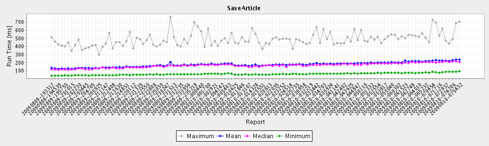
A trend chart
Additionally, the run time difference values (in percent) are displayed in two tables with color-coded cells, as seen in the comparison reports. The first table gives information how each test run behaved compared to the first test run in the series. Red table cells indicate that the last test run took longer than the first run. Green cells indicate an improvement.
The run time differences relative to the first test run
The second table visualizes the difference between the current test run and the previous test run, again using color-coded cells. This table gives you a more local view on all performance changes.
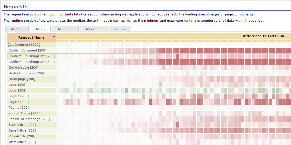
The table cells will not show percentage values if the number of values included in the trend report is too high. This avoids excessive scrolling when viewing the report. However, the cell background color will still give you an indication whether the current test run performed better or worse. Note that the numeric values are always available in the cell’s tool tip text, so just move the mouse over the cell to see the details.